Simple Table
Simple Table is a lightweight component built upon FFTable, offering functionalities for creating complex table headers and footers with ease. Unlike FFTable, it doesn't include a built-in form for editing data, paging and sorting. It's ideal for displaying read-only data with custom layouts.
Simple Table is perfect for scenarios where you need to display static or read-only data in a clean, well-formatted table. It provides all the essential features you need without the overhead of the more complex FFTable component.
Whether you're building a simple report, a data dashboard, or a static content page, Simple Table provides the flexibility and functionality you need to create beautiful, responsive tables.
Features
Simple Table offers a comprehensive set of features for creating professional, responsive tables. While it doesn't include the advanced editing and data management features of FFTable, it provides everything you need to create beautiful, functional tables for displaying read-only data.
- Complex header and footer layouts
- Dynamic row and cell styling
- Custom column formatting
- Responsive design
- Dark mode support
- Keyboard navigation support
- Screen reader accessibility
- Interactive hover states
Basic Implementation
Implementing Simple Table in your Fuwafuwa application is simple and straightforward. The component is designed to be easy to use, with minimal configuration required to get started.
To include Simple Table in your view, you'll need to add the component markup and configure it with your table data and options.
Include the component in your view:
<f3:inject id="content">
<div x-data="data" class="max-w-(--breakpoint-md)">
<include href="blocks/simple-table.html" />
</div>
</f3:inject>
<f3:inject id="script" mode="append">
<script src="{{@BASE}}/js/fftable.min.js"></script>
<script src="{{@BASE}}/js/util.js"></script>
<script>
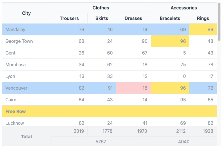
let data = {
table: {
fullWidth: true,
size: 'none',
display: 'compact',
containerClass: 'h-[60vh]',
// Dynamic row styling
rowClass(idx, row) {
return {
'whitespace-nowrap': true,
'bg-blue-200': idx % 5 == 0
};
},
// Dynamic cell styling
cellClass(cidx, ridx, row, col) {
return {
'bg-red-200': ridx == 5 && cidx == 3,
'bg-yellow-200': row[col] > 95,
}
},
// Column definitions
columns: [
{ name: 'city' },
{ name: 'trousers', class: 'text-right', type: 'number' },
{ name: 'skirts', class: 'text-right', type: 'number' },
{ name: 'dresses', class: 'text-right', type: 'number' },
{ name: 'bracelets', class: 'text-right', type: 'number' },
{ name: 'rings', class: 'text-right', type: 'number' }
],
// Complex header with merged cells
customHeader: [
[
{ title: 'City', attr: { rowspan: 2 }, class: 'border-r border-t' },
{ title: 'Clothes', attr: { colspan: 3 }, class: 'border-r border-t' },
{ title: 'Accessories', attr: { colspan: 2 }, class: 'border-t' }
],
[
{ title: 'Trousers', class: 'border-r' },
{ title: 'Skirts', class: 'border-r' },
{ title: 'Dresses', class: 'border-r' },
{ title: 'Bracelets', class: 'border-r' },
{ title: 'Rings' }
]
],
// Footer with calculations
customFooter: [
[
{ value: 'Total', class: 'font-bold border-r text-center', attr: { rowspan: 2 } },
{ name: 'total-trousers', class: 'text-right border-r' },
{ name: 'total-skirts', class: 'text-right border-r' },
{ name: 'total-dresses', class: 'text-right border-r' },
{ name: 'total-bracelets', class: 'text-right border-r' },
{ name: 'total-rings', class: 'text-right' }
]
]
}
};
</script>
</f3:inject>Configuration Options
Simple Table offers a wide range of configuration options that allow you to customize every aspect of your table's appearance and behavior. From basic styling to complex header and footer layouts, you have full control over how your table looks and functions.
The configuration options are divided into several sections, each focusing on a specific aspect of the table. This makes it easy to find and configure the options you need.
Table Properties
| Property | Description |
|---|---|
fullWidth |
Make table fill container width |
size |
Table padding size: 'sm', 'md', 'lg', or 'none' |
display |
Display style: 'default' or 'compact' |
containerClass |
CSS classes for the table container |
role |
ARIA role attributes for accessibility (automatically set) |
aria-label |
Screen reader description (automatically set to "Data table") |
Dynamic Styling
| Property | Description |
|---|---|
rowClass(idx, row) |
Function to return classes for each row |
cellClass(cidx, ridx, row, col) |
Function to return classes for each cell |
Column Configuration
| Property | Description |
|---|---|
name |
Column identifier matching data field |
class |
CSS classes for the column |
type |
Data type: 'text', 'number', 'date', etc. |
Complex Headers & Footers
| Property | Description |
|---|---|
customHeader |
Array of row arrays for complex headers |
customFooter |
Array of row arrays for complex footers |
title |
Header cell content |
value |
Footer cell static content |
name |
Footer cell dynamic content from data |
attr |
HTML attributes (colspan, rowspan) |
Best Practices
To get the most out of Simple Table, it's important to follow best practices for table design and implementation. These practices will help ensure that your tables are accessible, responsive, and maintainable.
- Use semantic column types for proper data formatting
- Implement responsive classes for mobile compatibility
- Use consistent border classes for merged cells
- Add descriptive headers and footers for data clarity
- Implement dynamic styling for better data visualization
- Ensure table headers have meaningful descriptions for screen readers
- Test keyboard navigation for accessibility compliance
- Maintain sufficient color contrast for hover and focus states
Accessibility Features
Simple Table is designed with accessibility in mind. It includes a range of features to ensure that your tables are accessible to all users, including those with disabilities.
| Feature | Description |
|---|---|
Keyboard Navigation |
Rows are focusable using Tab key |
ARIA Roles |
Semantic table roles for screen readers |
Focus States |
Visual indicators for keyboard navigation |
Screen Reader Support |
Proper table structure and labeling |
Properties Reference
This section provides a comprehensive reference of all the properties available for configuring Simple Table. These properties allow you to customize every aspect of your table's appearance and behavior.
| Property | Description |
|---|---|
fullWidth |
Boolean, to use full width of container or flow as content width |
display |
compact|normal specify padding between cells |
containerClass |
Class for container |
rowClass |
Class for row, can be a constant or a function that receive index and data as parameter |
cellClass |
Class for cell, can be a constant or a function that receive col index, row index, data and col name as parameter |
customHeader |
Define non standard table header. If undefined, standard table header created from columns definition |
columns |
Data Structure definition for Simple Table |
data |
Data to be rendered. There is special row that has "__customRow" property where we can display anything, usually when we want to draw separator |
customFooter |
Define complex footer |
footerData |
Data for customFooter |
Interactive States
Simple Table provides a range of interactive states to enhance the user experience. These states provide visual feedback to users, making it easier to understand and interact with the table.
| State | Description |
|---|---|
Hover |
Light highlight on row hover (bg-gray-50 in light mode, bg-gray-600 in dark mode) |
Focus |
Distinct highlight when row is focused (bg-gray-100 in light mode, bg-gray-500 in dark mode) |
See demo here.