FFTable Flagship
FFTable is the flagship feature of Fuwafuwa Framework. This powerful component allows you to quickly build beautiful, responsive data tables with advanced features. Whether you need a simple read-only table or a complex interactive data management interface, FFTable has you covered.
FFTable provides a comprehensive set of features, including multiple column sorting, advanced searching, customizable field formatting, pagination, and built-in add/modify/delete functionality. All of this is wrapped in a modern, responsive design that works seamlessly on desktop and mobile devices.
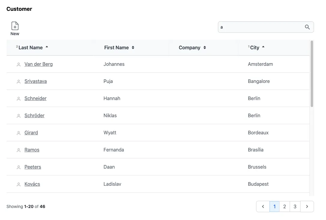
Let's review the Customer view from the Chinook sample application to see FFTable in action:
Model Example
The foundation of any FFTable implementation is the model. The model defines the data structure and
validation rules for your table. For FFTable to work properly, your model should extend the base
\Fuwafuwa\BaseModel class, which provides all the necessary functionality for data access
and manipulation.
<?php
// MODEL: app/controllers/user/model/chinook/customer.php
namespace Model\Chinook;

class Customer extends \Fuwafuwa\BaseModel {

    function __construct(\Data\Chinook $db) {
        parent::__construct($db, 'Customer', ['ai_field' => 'CustomerId',]);
        $this->validation = [
            'rules' => [
                'FirstName' => 'required',
                'LastName' => 'required',
                'Address' => 'required',
                'Email' => 'required|email',
            ]
        ];
    }
}
Controller Example
The controller handles the communication between your FFTable view and the server. Fuwafuwa provides a
specialized \Fuwafuwa\Controller\FFTable class that simplifies the process of creating
controllers for your data tables.
The FFTable controller class provides built-in methods for handling common table operations like listing records, editing records, and deleting records. This makes it incredibly simple to create a fully functional data table with just a few lines of code.
<?php
// CONTROLLER: app/controllers/user/ajax/chinook/employee.php

namespace Ajax\Chinook;

class Employee extends \Fuwafuwa\Controller\FFTable {

    function list($f3) {
        $this->recordList('\Model\Chinook\Employee');
    }

    function edit($f3) {
        $this->ajaxEdit('\Model\Chinook\Employee');
    }

    function elist($f3) {
        $sql = "SELECT e.*, h.FirstName as HeadFirstName, h.LastName as HeadLastName
        FROM Employee e
        LEFT JOIN Employee h ON e.ReportsTo = h.EmployeeId ";
        $csql = "SELECT COUNT(1) FROM Employee e";
        $this->recordElist($sql, $csql);
    }
}
For simple table without lookup from other table, the controller code become very simple, only
edit and list method is required. The complexity of pagination, searching, sorting are
handled by FFTable.
View Example
The view is where you define the configuration for your FFTable. This includes defining the fields to display, table options, and form options for adding/editing records. The view also includes the HTML markup for rendering the table.
FFTable views are simple and straightforward. You typically just need to include the table and modal-form blocks, and then define your table configuration in a script tag.
<f3:inject id="content">
    <h2>Customer</h2>
    <div x-data="data">
    <include href="blocks/table.html" />
    <include href="blocks/modal-form.html" />
    </div>
</f3:inject>
<f3:inject id="script">
    <script src="{{@BASE}}/js/fftable-pack.min.js"></script>
    <script type="text/javascript">
    let settings = {
        fields: [
        {
            title: 'Customer Id', name: 'CustomerId', visible: false, readonly: true
        },
        {
            title: 'Support Rep', name: 'SupportRepId', visible: false, type: 'select', triggerChange(d) {
            fetchData('{{@BASE}}/ajax/chinook/employee/select-option',).then(data => {
                this.options = data;
            });
            },
        },
        {
            title: 'Last Name', name: 'LastName', formatter(v, c, d) {
            return `<svg viewBox="0 0 24 24" class="inline mr-2 stroke-1 size-4 stroke-gray-500 dark:stroke-gray-400 fill-transparent">
        <use href="#people" />
    </svg> <a class="underline" href="{{@BASE}}/chinook/customer/${d.CustomerId}">${v}</a>`;
            }, raw: true, class: 'whitespace-nowrap', searchable: true
        },
        { title: 'First Name', name: 'FirstName', searchable: true },
        { title: 'Company', name: 'Company', class: 'whitespace-nowrap' },
        { title: 'Address', name: 'Address', visible: false, type: 'textarea', fclass: 'md:col-span-2' },
        { title: 'City', name: 'City', class: 'whitespace-nowrap' },
        { title: 'State', name: 'State', visible: false, },
        { title: 'Country', name: 'Country', visible: false, },
        { title: 'PostalCode', name: 'PostalCode', visible: false, },
        { title: 'Phone', name: 'Phone', visible: false, type: 'tel' },
        { title: 'Fax', name: 'Fax', visible: false, type: 'tel' },
        { title: 'Email', name: 'Email', visible: false, type: 'email' },
        ],

        // table options
        table: {
            url: '{{@BASE}}/ajax/chinook/customer/list',
            editable: true,
            selection: 'single',
            pageSize: 20,
            sorting: 'multiple'
            size: 'large',
            // display: 'compact',
        },

        // form options
        form: {
            url: '{{@BASE}}/ajax/chinook/customer/edit',
            object: 'Customer',
            size: 'normal', // small, normal, large, huge
            columns: 2,
            size: 'large',
            pk: ['CustomerId'], // primary key
        }
    }
    let data = FFTable(settings);
    </script>
</f3:inject>
<include href="blocks/popup.html" />
In the content section, we simply include table and modal-form blocks. The detail is in the script
section, where the table configuration is defined. Table configuration consists of fields, table
and form property. Available properties for each are below:
Fields Configuration
Fields configuration is one of the most important parts of working with FFTable. It defines the columns that will be displayed in the table and the fields that will be available in the add/edit form.
Each field in FFTable has a wide range of configuration options. You can control everything from the field's title and visibility to its type, validation rules, and formatting.
Fields define columns that we want to show in table and form.
| Property | Description |
|---|---|
title |
Field title in table column and form |
name |
Field name in table |
visible |
If set false, will not show in table |
virtual |
If set true, will not show in form |
readonly |
If set true, uneditable in form |
hidden |
Hidden in form and table, but still submit value |
sortable |
Boolean, show sorting icons at column header |
inline |
Show title and input side by side |
type |
HTML input type in form (text, date, month, email, etc). Additional types: uploader, checkboxes. Uploader type needs to initiate uploader method. Checkboxes type needs to define encoder, decoder, and default to [], as array will be used as basic operation. |
default |
Default value on create new object |
attr |
Array of attribute to apply to input element (including Alpine JS attributes). Example: { 'x-on:keyup.debounce': 'check_input()', 'maxlength': 100 } |
validator |
function(value, column, data) to validate current value. Return true or error message. |
formatter |
function(value, column, data) to format current value. Example: function(v) { return '$' + v } will add dollar prefix to the value. |
encoder |
function(value, column, data) to format data before saving into database: function(v) { return JSON.stringify(v) } will convert data into JSON string. |
decoder |
function(value, column, data) to parse data from database: function(v) { return JSON.parse(v) } will parse JSON string into array. |
raw |
Display as html code or let browser display like ordinary html code |
initOptions |
function(data) to be executed in form show event. Usually for initialization of select options. |
triggerChange |
function(data) to be executed when there is a change on watched properties. Parameter d contains current data. After executing fetchData, it will set options property of this (current field). |
watch |
Array of column change to watch |
searchable |
Field is searchable from search bar |
class |
CSS class for table column |
fclass |
CSS class for form field |
queryPrefix |
If you join two or more tables as controller, this prefix + field name will be put in search and order by clause. |
lookupUrl |
URL for remote autocomplete/srselect data fetching |
lookupLabel |
Field name of display value. For example we use IdUser and Username pair to represent user in join query, then lookupLabel is assigned with Username. |
staticLookup |
If set to true, lookup is only performed once, and query is ignored. Useful if there are considerable amount of select options, and we don't want to put in the code. Use dynamic lookup if there are so many options and it'd better to search with query. |
filter |
{ op: 'LIKE' } Add filter above table. Op is query operator. If op is BETWEEN, second input filter will be shown. Valid op: LIKE, CONTAINS, START(S), END(S), IS (NOT) NULL, IN, < <= > >= = <> != |
Table Options
The table options section defines how your FFTable will be displayed and behave. It includes configuration for things like the table's URL, pagination, search functionality, and various display settings.
These options give you full control over the user experience of your data table. You can configure everything from the number of records per page to whether the table is editable or deletable.
Table section defines table display parameters.
| Property | Description |
|---|---|
url |
URL to table query controller |
addable |
Show add button in toolbar |
editable |
Show edit button in toolbar |
deletable |
Show delete button in toolbar |
printable |
Show print button in toolbar |
exportable |
Show export button in toolbar |
searchable |
If searchable, show search bar |
selection |
none, single, multiple |
sorting |
none, single, multiple |
pageSize |
Number of record to display per page |
display |
normal, compact |
displayClass |
Additional class for table |
rowClass |
Additional class for row. A string or function rowClass(idx, row) |
cellClass |
Additional class for cell. A string or function cellClass(ridx, cidx, row, col) |
size |
small, normal, large. On mobile, all sizes are the same. |
deferLoading |
Don't fetch data after initialization. |
customHeader |
Define complex table header |
footerData |
Create sticky footer at the bottom |
functions |
Array of functions that will override default button function. Each function needs to return true. |
eventHandler |
function(event, data) |
filter |
Filter configuration: { cols: 1, width: 'xl:w-2/3' } |
toolbar |
Additional toolbar button configuration |
tableInit() |
tableInit event, run once to set up table |
Custom Header Example
customHeader: [
    [
        { title: 'City', attr: { rowspan: 2 }, class: 'border-r border-t' },
        { title: 'Clothes', attr: { colspan: 3 }, class: 'border-r border-t' },
        { title: 'Accessories', attr: { colspan: 2 }, class: 'border-t' }
    ],
    [
        { title: 'Trousers', class: 'border-r' },
        { title: 'Skirts', class: 'border-r' },
        { title: 'Dresses', class: 'border-r' },
        { title: 'Bracelets', class: 'border-r' },
        { title: 'Rings' },
    ]
],
Footer Data Example
footerData: [
    [
        { value: 'Total' },
        { name: 'sum-trousers', value: 10, class: 'text-right' },
        { name: 'sum-skirts', value: 10, class(v) { return { 'text-right': true, 'italic': v < 1000 } }, formatter(v) { return v + 5 } },
        { name: 'sum-dresses', value: 10, class: 'text-right' },
        { name: 'sum-bracelets', value: 10, class: 'text-right' },
        { name: 'sum-rings', value: 10, class: 'text-right' },
    ],
    [
        { value: '%' },
        { name: 'total-trousers', value: 10, class: 'text-right' },
        { name: 'total-skirts', value: 10, class: 'text-right', formatter(v) { return v + 5 } },
        { name: 'total-dresses', value: 10, class: 'text-right' },
        { name: 'total-bracelets', value: 10, class: 'text-right' },
        { name: 'total-rings', value: 10, class: 'text-right' },
    ],
],
Form Options
The form options section defines how the add/edit form will be displayed and behave. It includes configuration for things like the form's URL, title, size, and layout.
These options give you control over the user experience of your form. You can configure everything from the form's size and number of columns to the primary key field(s) and various event handlers.
Form section defines form display parameters.
| Property | Description |
|---|---|
url |
URL to form controller |
object |
Title to display in form |
size |
small, normal, large, huge. On mobile, all sizes are the same. |
columns |
Number of columns in form. On mobile, only 1 column. |
pk |
Array of primary key |
fullHeight |
If true, the content container will be full height and having vertical scrollbar. If not, the content container will fit the content. |
formInit() |
formInit event, run once to set up form |
preSubmit |
function(data, oper) before submit, modify and return the data back |
onSubmitted |
function(data, oper) after submission, modify data before display |
onShow |
function(data) modify data before showing form and return the data back |
Form Field Types
FFTable supports various form field types for different data entry needs. Each type provides specialized UI components and behaviors to enhance the user experience.
Basic Field Types
| Type | Description | Example |
|---|---|---|
text |
Single-line text input (default) | { name: 'username', type: 'text' } |
textarea |
Multi-line text input | { name: 'description', type: 'textarea' } |
number |
Numeric input with stepper | { name: 'quantity', type: 'number' } |
date |
Date picker | { name: 'birthdate', type: 'date' } |
datetime |
Date and time picker | { name: 'scheduled_at', type: 'datetime' } |
checkbox |
Boolean checkbox | { name: 'is_active', type: 'checkbox' } |
select |
Dropdown with static options | { name: 'status', type: 'select', options: ['Active', 'Inactive'] } |
Autocomplete Field
The autocomplete type provides real-time search suggestions as the user types.
It can use static options or fetch suggestions from a remote URL.
{
    name: 'customer_name',
    code: 'customer_id',     // Hidden field to store the selected ID
    type: 'autocomplete',
    label: 'Customer',
    options: [               // Static options (optional if using lookupUrl)
        { value: 1, label: 'John Doe' },
        { value: 2, label: 'Jane Smith' }
    ]
}
Autocomplete with Remote Lookup
{
    name: 'product_name',
    code: 'product_id',
    type: 'autocomplete',
    label: 'Product',
    lookupUrl: '/api/products/search?query='  // URL for remote search
}
The lookupUrl endpoint should return an array of objects with value and label properties:
[
    { "value": 1, "label": "Product A" },
    { "value": 2, "label": "Product B" },
    { "value": 3, "label": "Product C" }
]
Autocomplete Attributes
| Attribute | Description |
|---|---|
name | Field name for display value |
code | Field name for ID value (stored in form data) |
options | Static options array (if not using lookupUrl) |
lookupUrl | URL endpoint for remote search |
Srselect Field (Searchable Select)
The srselect type provides a dropdown with search functionality, ideal for
selecting from large datasets where you need server-side filtering. It shows a button
that opens a searchable dropdown panel.
{
    name: 'category_id',
    type: 'srselect',
    label: 'Category',
    lookupUrl: '/api/categories/lookup'
}
Srselect with Custom Value/Label Fields
{
    name: 'assigned_to',
    type: 'srselect',
    label: 'Assign To',
    lookupUrl: '/api/users/lookup',
    valueField: 'id',        // Field to use for value (default: 'id' or 'value')
    labelField: 'fullname'   // Field to use for display (default: 'label' or 'name')
}
Server-Side Implementation
The lookup endpoint receives a q query parameter:
// Controller: app/controllers/user/api/categories.php
function lookup($f3) {
    $query = $f3['GET.q'] ?? '';
    $db = c('\Fuwafuwa\Db');

    $sql = "SELECT id, name as label FROM categories
            WHERE name LIKE ?
            ORDER BY name LIMIT 20";

    $results = $db->exec($sql, ["%{$query}%"]);
    echo json_encode($results);
}
And a details endpoint for fetching single item by ID:
function details($f3) {
    $id = $f3['PARAMS.id'];
    $db = c('\Fuwafuwa\Db');

    $result = $db->exec(
        "SELECT id, name as label FROM categories WHERE id = ?",
        [$id]
    );

    echo json_encode($result[0] ?? null);
}
Srselect Attributes
| Attribute | Description |
|---|---|
lookupUrl | Base URL for search (required) |
valueField | Field name for value (default: 'id') |
labelField | Field name for display text (default: 'label') |
placeholder | Placeholder text when no selection |
When to Use Each Type
| Type | Best For | Example Use Case |
|---|---|---|
select |
Small, static option lists | Status: Active/Inactive/Pending |
autocomplete |
Type-ahead search with immediate suggestions | Customer names, product search |
srselect |
Large datasets requiring server-side search | User selection from thousands of records |
Progressive Loading
FFTable supports progressive loading (also known as infinite scrolling) for handling large datasets efficiently. This feature allows you to load records in batches as the user scrolls, which can significantly improve performance when working with very large datasets.
Progressive loading is especially useful for datasets that are too large to load all at once. It reduces the initial load time and memory usage, making your application feel much faster and more responsive.
FFTable supports progressive loading for handling large datasets efficiently:
let settings = {
    table: {
        progressiveLoad: true,  // Enable progressive loading
        size: 50,              // Records per page
        loadMoreText: 'Load More',  // Custom button text
        loadMoreClass: 'btn-primary' // Custom button class
    }
}
Progressive Loading Options
| Property | Description |
|---|---|
progressiveLoad |
Enable progressive loading instead of pagination |
size |
Number of records to load per request |
loadMoreText |
Text to display on the load more button |
loadMoreClass |
CSS class for the load more button |
Loading States
FFTable provides several loading states that you can use to enhance the user experience:
| Property | Description |
|---|---|
loading |
True when initial data is being loaded |
loadingMore |
True when additional data is being loaded |
meta.progressiveLoading |
True when progressive loading is active |
meta.showScrollTop |
True when scroll-to-top button should be shown |
Scroll Detection
When progressive loading is enabled, FFTable automatically detects when the user scrolls to the bottom of the table and loads more records. You can customize this behavior:
let settings = {
    table: {
        progressiveLoad: true,
        containerId: 'my-table-container',  // Container for scroll detection
        scrollOffset: 100  // Distance from bottom to trigger load
    }
}
Field Validation
FFTable provides comprehensive client-side validation for form fields. You can specify validation rules in the field configuration:
let settings = {
    fields: [{
        name: 'email',
        type: 'text',
        validation: {
            required: true,
            email: true,
            minLength: 5,
            maxLength: 100,
            pattern: /^[^\s@]+@[^\s@]+\.[^\s@]+$/,
            custom: (value) => value.endsWith('@company.com') || 'Must use company email'
        }
    }]
}
Available Validation Rules
| Rule | Description |
|---|---|
required |
Field must not be empty |
email |
Field must be a valid email address |
minLength |
Minimum length of the field value |
maxLength |
Maximum length of the field value |
min |
Minimum numeric value |
max |
Maximum numeric value |
pattern |
Regular expression pattern to match |
matches |
Field must match another field's value |
custom |
Custom validation function that returns true or error message |
Validation Methods
FFTable provides several methods to handle validation:
| Method | Description |
|---|---|
validation.getFieldError(fieldName) |
Get the first error message for a field |
validation.hasErrors() |
Check if any fields have validation errors |
validation.validateField(field, value) |
Validate a single field |
validation.validateForm() |
Validate all fields in the form |
Row Selection
FFTable supports both single and multiple row selection with keyboard navigation:
| Property | Description |
|---|---|
table.selection |
Set to 'single' or 'multiple' to enable row selection |
table.selectionCheckbox |
Show checkboxes for row selection |
isSelected(index) |
Check if a row is selected |
toggleSelect() |
Toggle selection of all rows |
Keyboard Navigation
The following keyboard shortcuts are supported:
| Shortcut | Description |
|---|---|
Arrow keys |
Move cursor up/down |
Space |
Select/deselect current row |
Shift + Click |
Select range of rows |
Ctrl/Cmd + Click |
Toggle individual row selection |
Ctrl/Cmd + A |
Select all rows |
Backend
Ajax backend for table is very simple. You only need to implement list and edit. Example:
<?php

namespace Ajax;

class User extends \Fuwafuwa\Controller\FFTable {

    function list(\Base $f3): void {
        $this->recordList('\Model\User');
    }

    function edit(\Base $f3): void {
        $this->ajaxEdit('\Model\User');
    }

    function elist($f3) {
        $sql = "SELECT al.*, ar.Name as ArtistName FROM Album al
            JOIN Artist ar ON al.ArtistId = ar.ArtistId";
        $csql = "SELECT COUNT(1) FROM Album al";
        $this->recordElist($sql, $csql);
    }
}
For list that involves complex query join, we can use elist method. In this method, we pass two query, one for listing, and the other for counting.
Generators
Generators also available for FFTable to get basic form of the MVC files and modify later. Run this command in CLI:
php index.php data/generator/model --table=Customer > app/controllers/user/model/customer.php
php index.php data/generator/fftable --table=Customer > app/views/user/customers.html
php index.php data/generator/ajax-fftable --table=Customer > app/controllers/user/ajax/table/customer.php
See demo here
Example Usage & Best Practices
Here's a complete example of FFTable configuration implementing recommended practices:
let settings = {
    // Field definitions with validation
    fields: [{
        name: 'id',
        type: 'hidden'
    }, {
        name: 'email',
        type: 'text',
        label: 'Email Address',
        validation: {
            required: true,
            email: true,
            custom: (value) => {
                // Custom validation with clear error message
                if (!value.includes('@company.com')) {
                    return 'Please use your company email address';
                }
                return true;
            }
        }
    }, {
        name: 'status',
        type: 'select',
        label: 'Status',
        options: ['Active', 'Inactive'],
        validation: { required: true }
    }, {
        name: 'role',
        type: 'srselect',
        label: 'Role',
        lookupUrl: '/api/roles/lookup',  // Server-side search for large datasets
        validation: { required: true }
    }],

    // Table configuration with performance optimizations
    table: {
        selection: 'multiple',
        selectionCheckbox: true,
        progressiveLoad: true,  // Better performance for large datasets
        size: 50,
        columns: [
            { field: 'email', sortable: true },
            { field: 'status', sortable: true },
            { field: 'role', sortable: true }
        ],
        // Clear loading states for better UX
        loadMoreText: 'Loading more records...',
        loadMoreClass: 'btn-primary animate-pulse'
    },

    // Form configuration with validation handling
    form: {
        title: 'User Details',
        submitText: 'Save Changes',
        cancelText: 'Cancel',
        // Validation before submission
        onBeforeSubmit: function(data) {
            if (!this.validation.validateForm()) {
                return false;
            }
            // Additional data processing if needed
            return data;
        },
        // Handle response after submission
        onSubmitted: function(response) {
            if (response.success) {
                // Show success message
                this.showMessage('Changes saved successfully');
                this.refreshData();
            } else {
                // Handle server-side validation errors
                this.handleErrors(response.errors);
            }
            return response;
        }
    }
}
Implementation
In your view file:
<!-- Include required components -->
<include href="blocks/table.html" />
<include href="blocks/form.html" />

<script>
    // Initialize with settings
    let settings = { /* Configuration from above */ };
    let table = new FFTable(settings);

    // Optional: Add custom keyboard shortcuts
    document.addEventListener('keydown', (e) => {
        if (e.ctrlKey && e.key === 'f') {
            e.preventDefault();
            table.focusSearch();
        }
    });
</script>
In your controller:
<?php
namespace Ajax;

class Users extends \Fuwafuwa\Controller\FFTable {
    // List records with server-side processing
    function list($f3) {
        // Apply filters and sorting server-side
        $filter = $this->getFilter();
        $sort = $this->getSort();

        $this->recordList('\Model\User', [
            'filter' => $filter,
            'sort' => $sort
        ]);
    }

    // Handle record editing with validation
    function edit($f3) {
        try {
            // Server-side validation
            if (!$this->validate()) {
                return $this->error('Validation failed');
            }

            $this->recordEdit('\Model\User');
        } catch (\Exception $e) {
            return $this->error($e->getMessage());
        }
    }
}
Best Practices Summary
| Practice | Implementation |
|---|---|
| Performance Optimization |
|
| Validation Strategy |
|
| User Experience |
|
| Code Organization |
|
UX Enhancement Modules
Fuwafuwa Framework includes standalone UX modules that enhance FFTable with advanced user interaction capabilities. These modules are built with Alpine.js and can be used independently or together:
Inline Editing
The inline-edit module allows users to edit table cells directly by double-clicking on them:
<!-- Include the module -->
<script src="{{@BASE}}/js/inline-edit.min.js"></script>

<div x-data="inlineEditTable">
    <table>
        <tbody>
            <tr x-show="isEditing(rowIndex, 'name')">
                <input x-model="editValue"
                       @keydown="handleEditKeydown($event, rowIndex, 'name')"
                       @blur="saveCell(rowIndex, 'name')" />
            </tr>
            <tr x-show="!isEditing(rowIndex, 'name')">
                <span @dblclick="editCell(rowIndex, 'name', row.name)"></span>
            </tr>
        </tbody>
    </table>
</div>
Features
- Double-click to edit any cell
- Enter to save, Escape to cancel
- Tab to save and move to next cell
- Optional auto-save on blur
- Per-field editability control
Example
See /examples/inline-edit for a complete working example.
Bulk Actions
The bulk-actions module provides multi-row selection and bulk operations:
<!-- Include the module -->
<script src="{{@BASE}}/js/bulk-actions.min.js"></script>

<!-- Bulk actions bar (shown when rows selected) -->
<div x-show="hasSelection" class="bulk-actions-bar">
    <span><span x-text="selectionCount"></span> row(s) selected</span>
    <button @click="bulkExport('csv')">Export CSV</button>
    <button @click="bulkDelete">Delete</button>
</div>
Features
- Checkbox selection with "Select All" option
- Bulk delete with confirmation
- Bulk export to CSV
- Custom bulk actions
- Selection count indicator
Example
See /examples/bulk-actions for a complete working example.
Keyboard Navigation
The keyboard-navigation module adds vim-style keyboard shortcuts for table navigation:
<!-- Include the module -->
<script src="{{@BASE}}/js/keyboard-navigation.min.js"></script>

<!-- Table with keyboard navigation enabled -->
<div x-data="keyboardTable" tabindex="0">
    <!-- Table content -->
</div>
Keyboard Shortcuts
| Shortcut | Description |
|---|---|
j / ↓ |
Move down |
k / ↑ |
Move up |
Enter |
Edit focused row |
Delete / d |
Delete focused row |
Space |
Toggle row selection |
/ |
Focus search |
Ctrl+N |
Add new row |
Escape |
Clear selection / Close dialogs |
? |
Show keyboard shortcuts help |
Wizard Form
The wizard-form component provides multi-step form with progress indicator:
<div x-data="employeeWizard">
    <!-- Progress steps -->
    <div class="flex items-center justify-between">
        <template x-for="(step, index) in steps" :key="index">
            <div @click="goToStep(index)" :class="getStepClass(index)">
                <span x-show="currentStep > index">✓</span>
                <span x-show="currentStep <= index" x-text="index + 1"></span>
            </div>
        </template>
    </div>

    <!-- Step content -->
    <div x-show="currentStep === 0">...</div>
    <div x-show="currentStep === 1">...</div>

    <!-- Navigation -->
    <button @click="previousStep">Previous</button>
    <button @click="nextStep">Next</button>
</div>
Features
- Multi-step form with progress indicator
- Step validation before proceeding
- Navigation between steps
- Visual progress feedback
- Summary and confirmation on final step
Example
See /examples/wizard-form for a complete working example.
Using UX Modules Together
You can combine multiple UX modules for enhanced functionality:
<!-- Include all modules -->
<script src="{{@BASE}}/js/inline-edit.min.js"></script>
<script src="{{@BASE}}/js/bulk-actions.min.js"></script>
<script src="{{@BASE}}/js/keyboard-navigation.min.js"></script>

<!-- Enhanced table with all features -->
<div x-data="enhancedTable"
     tabindex="0"
     @click="tableFocused = true">
    <!-- Inline editing + Bulk actions + Keyboard navigation -->
</div>
Module API Reference
Inline Edit Module
| Method | Description |
|---|---|
editCell(rowIndex, field, value) |
Start editing a cell |
saveCell(rowIndex, field) |
Save the edited value |
cancelEdit() |
Cancel editing and revert |
isEditing(rowIndex, field) |
Check if cell is being edited |
isFieldEditable(field) |
Check if field is editable |
Bulk Actions Module
| Method | Description |
|---|---|
toggleRowSelection(index, row) |
Toggle selection of a row |
toggleSelectAll() |
Toggle selection of all rows |
clearSelection() |
Clear all selections |
bulkDelete() |
Delete all selected rows |
bulkExport(format) |
Export selected rows |
hasSelection |
Check if any rows are selected |
selectionCount |
Get count of selected rows |
Keyboard Navigation Module
| Method | Description |
|---|---|
navigateRow(direction, data) |
Move up/down through rows |
navigatePage(direction) |
Navigate to previous/next page |
editFocusedRow() |
Edit the currently focused row |
deleteFocusedRow() |
Delete the currently focused row |
toggleRowSelection() |
Toggle selection of focused row |
focusSearch() |
Focus the search input |
showKeyboardHelp() |
Show keyboard shortcuts help |
Build System & Modular Architecture
FFTable is built with a modular architecture that provides better maintainability, easier debugging, and smaller bundle sizes. The modular version is recommended over the legacy monolithic version.
Build Outputs
| File | Description | When to Use |
|---|---|---|
fftable-pack.min.js |
Modular bundle (recommended) | Production applications |
fftable-pack.js |
Unminified modular bundle | Development/debugging |
fftable.min.js |
Legacy monolithic version | Backward compatibility only |
Using the Modular Bundle
Replace the old script tag with the new modular bundle:
<!-- Old (legacy) -->
<script src="{{@BASE}}/js/fftable-pack.min.js"></script>

<!-- New (recommended) -->
<script src="{{@BASE}}/js/fftable-pack.min.js"></script>
The modular bundle is fully backward compatible - no code changes required.
Building FFTable
If you need to customize or rebuild FFTable:
# Build the modular bundle
gulp js_bundle

# Build and minify all JS files
gulp js

# Watch for changes during development
gulp watch
Module Structure
The modular build combines these modules in order:
- core.js - Base FFTable instance and utilities
- initialization.js - Setup and field processing
- data-fetching.js - Pagination and progressive loading
- sorting.js - Column sorting functionality
- selection.js - Row selection and keyboard navigation
- form.js - CRUD operations and form handling
- validation.js - Form validation and error handling
- uploader.js - File upload/download management
- events.js - Event handling and master-slave relationships
- autocomplete.js - Autocomplete component
Security Improvements
The modular bundle includes security enhancements:
- Secure Random IDs - Uses cryptographically secure random generation for form and table IDs (replaces vulnerable
Math.random()) - Reduced Attack Surface - Modular structure allows including only needed functionality
- No code changes required when switching to modular bundle
- The modular bundle is smaller and more secure
- All existing FFTable configurations work unchanged